


Article originally posted on Medium.com.
Introduction
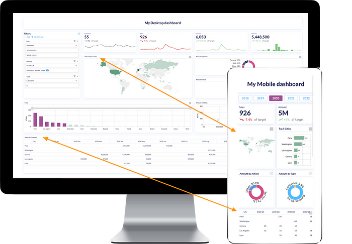
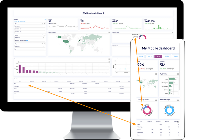
When creating dashboards for a company or product, whether they’re for mobile or a computer/desktop screen, it’s important to keep in mind that the way users read and interact with dashboards vary between screens. A ‘same’ dashboard on desktop and mobile could in theory be the same, but it’s actually not that obvious. We can quickly stumble upon sizing, quantity of elements, mouse vs. touch, and other constraints that need thinking-through.
This article gives an overview of the following topics:
- Arrangement & quantity of elements
- Filters
- Headers
- Hover effects
- Selection
- Sizing
- Responsiveness
to illustrate how desktop and mobile dashboards can differ and should sometimes be created separately, for high-quality and professional results.
NB: In this article, “computer/desktop” screens refer to laptop and desktop screens (usually 13" to 27"). You can push customization much further and differentiate laptop from desktop, but here we’ll be grouping these and focusing on their difference with mobile screens (usually 5" to 6".)
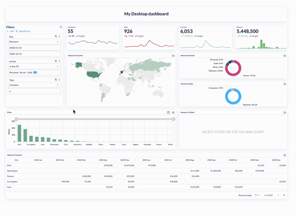
1. Arrangement & quantity of elements
Desktops are wide and mobiles are narrow, it therefore goes without saying that it makes sense to add many more charts horizontally in desktop dashboards than in mobile dashboards. Limit the number of charts side-by-side in mobiles to one or two but not more.
In general, the quantity of charts in mobile dashboards is lower than on desktop dashboards: by limiting filters as mentioned above, or just for the sake of simplicity. Overcrowded mobile dashboards can easily become unreadable.
2. Filters
Filters on dashboards should be easily visible whether they are on a desktop or on a mobile. Buttons, checkboxes, date pickers, filter panels, etc are useful for data discovery, but take space in a dashboard. Avoid crowding mobile dashboards with filters, prefer using a single or no filters as, not only you lose the visually visible filter as soon as you start scrolling, but also the dashboard can become difficult to read — and messy — on the limited-size mobile screen.

3. Headers
Headers, i.e. top spacing usually containing chart titles and the chart’s menu, could be hidden or placed elsewhere on mobile dashboards. Functionality will be lost but spacing will be gained. Consider removing headers when not needed in mobile dashboards.
4. Hover effects
In desktop dashboards, there are many ways to style tooltips and any hover elements: individual tooltips, chart cursor, tooltips on icons, etc.
However, hover effects are in fact not possible in mobiles. Workarounds need to be thought through, some options could include:
- Adding extra labels on the chart instead of a tooltip (mind proportions! Check the ‘Sizing’ paragraph below)
- Help icons in a chart can be clickable to open a dialog box instead of an on-hover tooltip.
5. Selection
Selection itself on mobiles can be tricky. If a click on a chart is filtering many other charts, these charts may not be visible on the mobile’s small screen. Better to either keep selections very simple or only activate them on desktop dashboards.
Multi-selection is even trickier, the usual mouse Ctrl+click or click+hold+slide used for multi-selection is not possible on mobiles.
Technical workarounds for mobiles can be found; for example, holding a bar then selecting others, but could require advanced development. Most importantly, remember that dashboards should be easy to navigate. If too complex non-intuitive manipulations are necessary, the user can be lost by focusing on functional aspects instead of concentrating on what’s really important, data!
Last note on selection, keep in mind not everyone has the same finger size :) Avoid having the reader get frustrated by not being able to click on something because it’s too small, or on the contrary, having too many interactions ending up on a touch nightmare, especially when combined with scrolling.
6. Sizing
It goes without saying that a dashboard on a desktop screen, laptop and mobile have different sizings. 27", 13" and 6" screens call for different experiences and flexibility.
The sizing of labels, text and titles will usually adapt to the screen size. But sometimes even with size adjustments, widgets get overcrowded for small mobile screens. In these cases, some other configurations may be necessary to make the dashboard proportional, and simply, look good on a mobile.
6.1 Cosmetic change
- Table style + font & font size + spacing. Tables can for example have grids, and an adapted font size for the computer screen. On a mobile however, we lack space so gridlines could for instance be removed, a lighter font can be used, and also, spacing between labels and values may differ for a more comfortable reading. These elements can also be considered for other charts.
- Donut charts’ labels. Usually donut labels are horizontal, aligned outside the donut. In mobiles, an option could be to bend labels (provided that you don’t have many slices). In icCube, this is a ‘variant’ of the donut chart.
6.2 Data change
- Donut chart slice quantity. On computer screens, we may be able to visualize many slices of a donut, whereas on a mobile it would be unreadable. An option is to substitute the smaller slices by grouping them into a single group usually called ‘Other’. In icCube, this is achievable with the ‘Group to Other’ transformation. The data that populates the chart is different from the original, and is therefore not just a cosmetic adjustment between desktop and mobile dashboards.
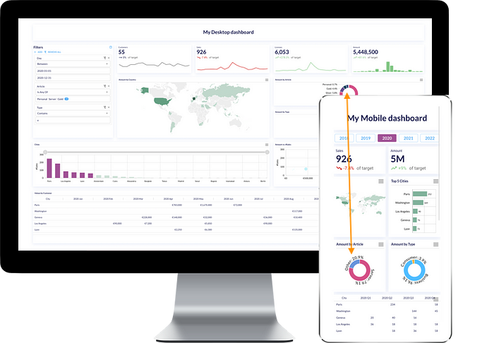
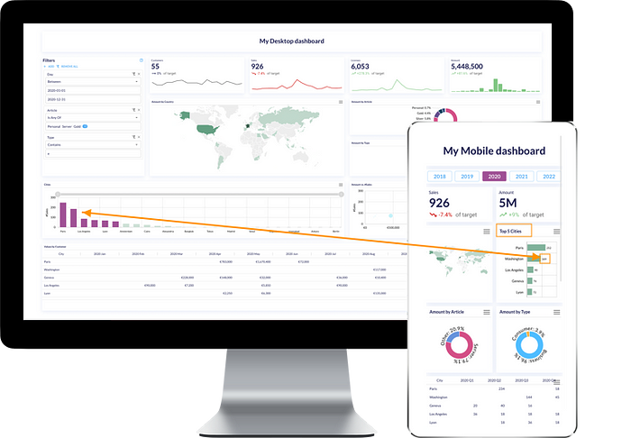
- Bar/Column chart elements. It’s usual to compare values by plotting them in either bar or column charts in descending order, for example, sales amounts by city from highest to lowest. In computer screens, this is easily achievable even if you have 50 cities: you can adjust the axis’ label spacing, add zoom options such as chart cursors or scrollbars. On mobiles, it gets difficult to view that much data. Prefer displaying top 5 cities in this case for example. Again, here the data behind needs to be adapted.
6.3 Formatting change
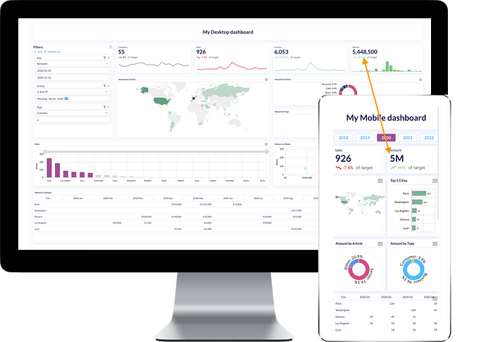
- Value formatting. The typical example would be a KPI box displaying a value. In a computer screen you can allow large numbers and decimals, but in a mobile, a long number could lose the visual purpose of a KPI box that is to draw attention to a value if its sizing is too small. Prefer reduced number formats for mobiles, for example, 5’000’000.00 could be in scientific format (5 e+6) or using number prefixes/suffixes (5M).
7. Responsiveness
To talk about responsiveness, we have to first keep in mind the ‘Sizing’ and ‘Arrangement & quantity of elements’ paragraphs above. Next there is spacing between charts, whether they have fixed sizes or if their positions are fixed.
To use the same dashboard for both desktop and mobile, make sure responsiveness is supported for your dashboards, especially if you have many charts side-by-side. In icCube, from v8.4.4 there are two responsiveness behaviors available: Grid and Grid (Split 50%).
What’s the hard part? It's when you have dashboards containing groups of charts that should belong together. For example, a filter together with two charts, with separators between them and a common title - apart from other elements. These are already 5 to 6 elements in your dashboard. So what happens on mobiles? The answer is not that simple. This special case may require implementing a custom responsiveness algorithm that answers these specific needs, or indeed, creating a mobile-specific version of your dashboard. If you have encountered a universal responsiveness solution, I’m all ears :)
Conclusion
There is no mystery, desktop dashboards and mobile dashboards − as for web portals and apps − are not the same! They need special care and can diverge in many aspects, which could mean creating separate dashboards for different screens. Most often, you can use out-of-the-box responsiveness techniques and resizing, but sometimes that’s not enough. To have slick, high-quality dashboards, mind each screen-specific detail for a professional outcome.