fbpx

You want to get the attention of your stakeholders and decided using a Pie chart.

Did you know Pie charts are one of the worst visualizations available and an ideal way for confusing your audience ?

It is all about the misleading aspects of a pie chart by its very nature; pie charts provide deceiving visuals. If you want to present insights to your audience, you should not consider of using them at all. Of course, if you are intentional in hiding your data, go ahead, pie charts are the right choice for you …

That is the key takeaway of this post. If you have no more time you can skip to the next article. If you are curious about the underlying reason why pie charts do not provide the right insights, continue reading. In about 5 minutes you will see it for yourself.

Here starts the story why a pie chart as a horrible choice for presenting your data.

Imagine you have prepared your Q1 report for the stakeholder meeting. One of your slides contains the following chart, with the sales figures for the top six major clients:


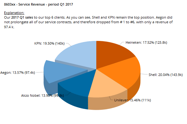
You did prepare it well and even provided extra information for the stakeholders to read. Your text says that the service revenue for “Aegon” were not so good this quarter and that “KPN” and “Shell” were the two top clients.

But now I want to ask you to forget the figures in this chart and to focus on the slices itself. Ok? Can you tell that the “Akzo Nobel” slice is smaller than the “Aegon” slice? Is the “Shell” slice bigger than the “KPN” slice? It is really difficult to tell. The confusion is caused by the fact that the pie chart is plotted in 3D. This makes it difficult for an human being to ‘view’ the relative sizes of the slices.

Ok, you argue, then get rid of the 3D effect. Perfect. According to the visualization expert Andy Kirk there are more improvements to be made in this particular chart. Here is his advice for pie charts:

  • order the clients using descending values;
  • position the first slice at the vertical 12 o’clock to help angle comparison of the first sector;
  • remove decorations such as 3D and the extruding slice.

And here it is, a regular, Andy Kirk proof, pie chart, with the same information. I modernized it transforming the chart into a donut shaped pie, but the basics are the same:


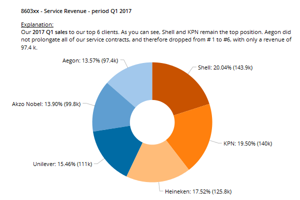
So, with all the expert advice applied, does it provide actionable and clear insights, can you quickly grasp see the size differences ?

Not really, it is still very difficult to make a distinction between the slices, isn’t it ? You read from the figures, how the slices relate to each other, you know they are ordered from large to small, but it is still hard to get a feeling on how the data relates to each other. The reason why it is not working is due to the wiring of our brain. Humans are not so good in comparing angles, especially not when the values to be compared do not differ so much.

That is why, a pie chart is a very bad choice in presenting your figures.

For the sake of exercise, have a look at the same data in a bar chart:


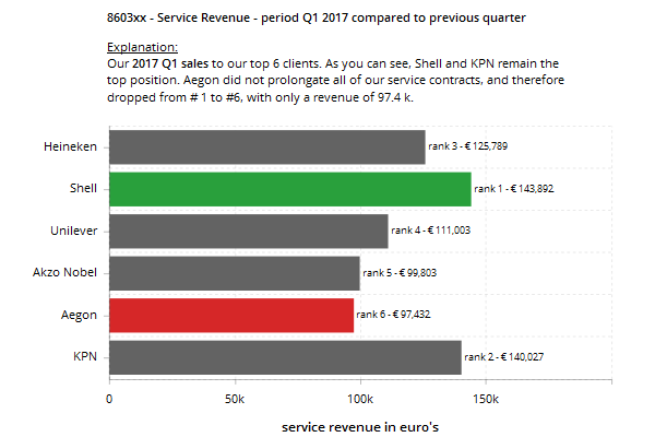
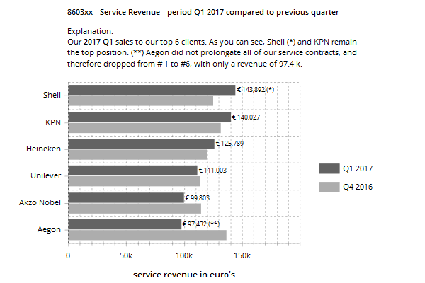
This works much better. It even looks as the underlying data is different, don’t you think ?

Our brains are very good in comparing positions along a scale. So, the classic bar chart works perfectly here. You can easily see which client had the best service revenue and which client had the worst. I embellished the chart a bit by adding conditional coloring; green for the best and red for the worst performer. But even without this information, you could easily spot this yourself.

Now we are at it; we could also include the previous quarter. You decide for yourself if this is an improvement for your audience:


Whichever you choose, be intentional in selecting your chart in presenting your figures to your audience. And if your intention is to confuse your audience, then a pie chart would be a good choice.

In all other situations, consider a chart that allows human brains to easily compare data. A bar chart is one of them.

about the author

Arthur van den Berg, www.inside-vision.com

It’s a kind of magic … to transform loads of data into insight giving dashboard products that show your audience what step to take next, based on your data.

I work closely together with icCube being a Dutch reseller. I love their product that allows me and my clients to launch meaningful dashboard products and to embed analytical insights into their software.

Get up to speed from loading your data to creating your first dashboard in 10 minutes.

Lesson #1a:
Building your schema (wizard)
Lesson #1b:
Building your schema (advanced)
Lesson #2:
Your first widget
(now playing…)

Always wanted to show location based insights to your audience on a vector map of your own (and not Google maps)? With icCube’s custom “Widget Template” you can! Here is how….

In this blog post I will explain how to create a custom spatial dashboard from a vector map and link the images to the data in icCube. But before you continue, please do not overwhelm your audience with spatial dashboards, just because you can! Always be intentional in why you choose for a particular visualization. A spatial dashboard can be of enormous help in very specific situations, but it can be really annoying, to say the least, if you apply it to answer questions your audience is not interested in.

So far the “teacher” … now on to the fun part.

In the next steps, I will guide you how to create a spatial dashboard yourself, by using a simple example for a cinema. Below you will see the cinema map (one room only) on which the seats are plotted. The general idea here is that we will analyze sales per seat; seats will light up (green) if a ticket has been sold for that day (I admit, this is not really a “killer” business case).

ingredients for a spatial dashboards

  • a vector map with objects that can be linked to data
  • an svg editor to edit the map
  • a text file editor
  • a hierarchy in icCube that contains unique object IDs that can be linked to objects in the vector map (in this example we have the dimension “chair” and the metric “tickets sold”).

steps for making the dashboard

step 1 – create or update the vector map

This is the creative part. Create or import a map in a drawing tool that supports vectors.

For this tutorial I have created a floor plan for the cinema in Inkscape: each seat is a rectangle. The cinema has 5 rows (A – E) and 8 seats (1 – 8):

vector drawing to be used in the dashboard in Inkscape

The colors of the seats are just for illustration purposes only as these will eventually be set by icCube, based on the underlying data.

step 2 – name all objects to corresponding IDs in data

This is the “magic trick”. To allow the seats (or vector objects) to be linked to the icCube data, each object must have a unique identifier (ID) that is also available in icCube. In Inkscape, this can be done by selecting the rectangle and then pressing ctrl + shift + o and adding the unique ID. In this case I use the seat code as unique ID:

add the unique ID to the object

step 3 – group the changeable objects

Group all the changeable objects and assign a unique id so it can be addressed using CSS. In this example we have provided a hover effect for each seat using CSS. This can be done by selecting and grouping all the seats and providing it with a recognizable ID, e.g. “chairs”:

#cinema1 g #chairs rect:hover {
cursor: pointer;
opacity: 0.5;
}

#cinema1 g #chairs rect.on {
stroke: black;
stroke-width: 1px;
}

Save the file and close the svg editor. Note that each object that you want to be colored by icCube should have a unique distinct ID.

step 4 – prepare your icCube model

Ensure that you have a dimension in your schema that consists of elements that have the ID you provided to the objects in the previous step. I have created a schema using the “in memory” data source with a dimension called “chair”. In practice you would build a dimension based on the metadata in your ticketing system.

The “in-memory” data has the following columns:

[table] column,data type, example date ticket sold, date field, e.g. 1 Nov 2016 chair, alphanumeric, ID for the seat e.g. A4 or E1 ticket sold, integer, number of tickets sold [/table]

Below the in-memory data source in the icCube Builder and its columns:

source data as used for this tutorial. Note the “chair” matches the object ID in the svg

The dimension “Chair” has been set up as:

  • key column = chair
  • name column = chair

(In practice, the key column would be a unique number and the name a meaningful label that is readable to the end user).

set-up of the “chair”. Note that the key column equals the object ID in the svg

That is a bit all there is for the model. The following MDX statement will provide the number of tickets per seat. Its result is going to be used in the dashboard:

[icCubeMdx]
SELECT {[Measures].[tickets]} ON 0,
[Chairs].[Chair].[chair].allmembers ON 1
FROM [Cube]
CELL PROPERTIES VALUE, FORMATTED_VALUE, STYLE
[/icCubeMdx]  

step 5 – blend all together in the widget template

Now, it is finally time to do some “magic”. Let’s bind all ingredients into a dashboard. Please stay with me, as this might get a bit complicated ;-).

First, we start with a fresh dashboard on the cinema schema described in the previous step and add a “Widget Template” (more details on this functionality can be found here).

To enable you to see the result, paste the MDX statement from the previous step in the “data” section (press tab “MDX” to paste it).

Navigate to the “Data Render” tab and add the property “Background Color” so it can be referenced later:

add the property “Background Color” so it can be used in the widget

Click on “Options” and fill the “After Render” and “HTML, data received” with the information further on in the blog post:

specific options for the spatial-bi blog post, refer to the text as how to make it

Then, open the svg file of the map you using a text editor. Select and copy the HTML code and paste it in the “HTML, data received” section:

paste the svg text in the HTML after …

Here is a sample of the code. Note that there is a bit of HTML code at the end that must be added as well (between the <style> and </style>):

<?xml version="1.0" encoding="UTF-8" standalone="no"?>
<!-- Created with Inkscape (http://www.inkscape.org/) -->

<svg
   xmlns:dc="http://purl.org/dc/elements/1.1/"
   xmlns:cc="http://creativecommons.org/ns#"
   xmlns:rdf="http://www.w3.org/1999/02/22-rdf-syntax-ns#"
   xmlns:svg="http://www.w3.org/2000/svg"
   xmlns="http://www.w3.org/2000/svg"
   xmlns:sodipodi="http://sodipodi.sourceforge.net/DTD/sodipodi-0.dtd"
   xmlns:inkscape="http://www.inkscape.org/namespaces/inkscape"
   id="cinema1"
   version="1.1"
   inkscape:version="0.91 r13725"
   xml:space="preserve"
   ... etcetera
   d="m 404.94566,317.86248 0,-142.35466"
   style="fill:none;fill-rule:evenodd;stroke:#888888;stroke-width:1.84;stroke-linecap:butt;stroke-linejoin:miter;stroke-stroke-miterlimit:4;stroke-dasharray:none" /></g></svg>

<style>
    #cinema1 g #chairs rect:hover {
        cursor: pointer;
        opacity: 0.5;
    }
    
    #cinema1 g #chairs rect.on {
        stroke: black;
    	stroke-width: 1px;
    }
</style>

<script>
    var allObjects = $("#cinema1 #chairs rect");
    
    allObjects.on("click", function() {
      	allObjects.removeAttr("class");
  		$(this).attr("class", "on");
    });

As a next step, add the javascript code to the “After Render” section:

add the javascript code in the text to this field

This is the code:

/**
 * You can bind events to node and it's children
 */
function(context, node, props) {
    
   	for (var row = 0; row < context.rowsCount; row++) {
        var idd = context.rowLabel(row);
        var color = context.cellValue(idd, 0,0);
        //var color = props.backColor(row,0) || '#ccc';
        
        // Find object
        var $object = $(node).find("#" + idd);
        
        // Change color and add row click
        $object.attr('style', 'fill:' + color)
               .click(function(row) {
            context.fireRowClick(row, 0);
            context.fireCellClick(row, 0);
        }.bind(this, row));
        
        // it's a bit special managing svg
        var titleElem = document.createElementNS("http://www.w3.org/2000/svg", "title");
        
        titleElem.textContent =  'seat '+ idd + ', tickets sold: '  + context.cellValue(idd, 0,1) ;
        $object.append( titleElem );
        
    }
}

You are almost there…

Click on the property “Background Color” value “Pallete for Cell values” and select the following:

select the palette to color the data

You should now be able to see the colored cinema seats.

If so, save the template so it can be used in any other dashboard:

In the “data render” tab, press [Save]:

save the template so you can use it in any dashboard

step 6 – use the template in your dashboard

Create a new dashboard and add the filter widgets of your choice. To add the cinema template, just created, select “Charts” > “Widget Template”. Add your MDX (remember to have the chair in the row and the numeric data in the first column). On the “data render” tab, click on the “default” icon under “Preset”. Now all available saved custom templates will be displayed. Select the one just created “Inside Vision Spatial Dashboard”:

use the previously created template in this dashboar

By changing the “Palette for Cell Values” for the property “Background color” you can tweak how the data is translated to colors.

This is my end-result:

the end result: the spatial bi dashboard showing ticket sales for a cinema

This was the last step of the tutorial, if you copied my steps, you should have now a spatial BI map of your choice.

More applications of the vector map

This icCube functionality is not limited to maps only. Any vector based file can be linked in this way to icCube. We think to use this functionality for our clients for the following applications:

  • interactive maps (hotels, flex workspace usage, holiday rentals, …)
  • interactive flow charts
  • custom sales funnels (not the standard boring pictures ;-))
  • interactive diagrams (machines, in- and outflows, education)

May be you have some great idea’s how to apply this nice feature to your company’s or clients’ data. Please share with us, so we together can build and educate the icCube community to create killer dashboards that really turn data into value.

FAQ

  • My svg doesn’t fit in the container, and it doesn’t adjust to the size of the container. The width and height of the svg are defined in the svg code itself. You can change these by changing the values of the width and height attribute. Preferably, set these to 100% (see the demo example).
  • The hover effect doesn’t work Recheck if the grouped id and the CSS selector are the same. If this isn’t the case, maybe your items are not rectangles, but paths. You can check this in the svg code. Simply change the CSS selector to path instead of rect.Another possible cause could be that the opacity is hard-coded in the svg. Check the objects in the svg code. Ensure to remove the opacity or fill-opacity field in the styling attribute for all objects using a simple text search and replace.
  • The click effect doesn’t work The click effect changes the stroke and the stroke-width. These attributes are probably hard-coded in your svg code. For each object in the svg code, remove these fields in the styling attribute. This can be done with a text search and replace.
  • I would like to change another svg attribute, next to the color At present, this is not supported, but you can contact icCube services to see how your specific needs can be addressed shortly.

about the author

Arthur van den Berg, www.inside-vision.com

It’s a kind of magic … to transform loads of data into insight giving dashboard products that show your audience what step to take next, based on your data.

I work closely together with icCube being a Dutch reseller. I love their product that allows me and my clients to launch meaningful dashboard products and to embed analytical insights into their software.

Out of the box, the icCube Web Reporting application is hosted within the embedded HTTP server of icCube. This setup is well suited for “simple” production usages that do not require an instensive usage of the HTTP server. For a more intensive reporting usage (e.g., reports publicly available to a large audience) we advise hosting the Web Reporting application within an enterprise Web server (e.g., Apache) and let icCube process the analytical (i.e., MDX) requests only. Continue reading “Web Reporting & Apache Integration”

Creating a user-defined Look and Feel

Half of the work of creating an impacting report or dashboard depends on the Look and Feel you choose. Even though icCube comes with a set of existing themes, you may want to create your own, for example, one that blends with an existing brand or solution identity.

Since version 5.0, we have made theming icCube easier and more powerful. A theme defines the colors, fonts, and default options for icCube widgets. It allows you to define those settings once for all reports. You can thus avoid having to set the theme for each one of the widgets, which would be cumbersome and error-prone.

In this post we explain how to create your own Look and Feel (called Theme) in icCube: MyCustomTheme. This is achieved by adding just a JavaScript and a CSS file. We’ll assume you have some basic JavaScript and CSS knowledge.

Creating a new theme requires some experience, but if you don’t have the time or skills, the icCube team will be happy to create a new theme for you. Just contact us.

The JavaScript file

In the first JavaScript file, let’s name it MyCustomTheme.js, we need to first define a self-invoking function.

(function () {
// code will come here
})();
Adding a Theme is simple. To register a new theme, we need to set the name and the cssCls property. The second property will be applied for all widget boxes as a CSS class; thus, we’ll be able to add widget specific CSS’s. The boxHeaderCls property is not mandatory. In this example, we’ll use it to define a CSS class for the widget headers.
ic3.Themes.registerTheme({
        name: "MyTheme",
        cssCls: "ic3t-myTheme",
        boxHeaderCls: "ic3h-myTheme"
    });

The CSS file

Now we will bind the classes defined in our JavaScript file with the CSS styles.

We’ll name our CSS file MyCustomCss.css and add a green border for all widgets in the report:

.ic3t-myTheme {
    border: 1px solid green;
}

We also want to add some CSS to the widget header:

.ic3h-myTheme .ic3-box-header {
    text-align: center;
    font-family: Arial;
    font-weight: bold;
}

Loading our theme into icCube

We need to tell icCube to load the files we have defined. We do this by adding the following code into ic3report-config.js file in the app-local folder:

function ic3bootstrapLocal(options) {
        .......
        ic3RegisterTheme('MyTheme', 'theme/', 'MyCustomCss.js' , 'MyCustomCss.css' );
 }

Both MyCustomCss.js and MyCustomCss.css are located in the ../app-local/theme/ directory.

We now have our simple theme that we can already test. But our job is far from finished.

AmChart style

The main reason to define a style for AmCharts widgets is to change the look and the colors of the widgets/charts. We start with a new color palette, binding it to AmCharts widgets.

We place the following code in the theme file (MyCustomTheme.js), right after the registration of the new theme.

var myColorPalette = ["#01450e","#027919","#24a93d","#7eb689","#c8d6ca"];
 
ic3.Themes.registerAmChartsWidgetStyle({
      name: "MyAmChartsStyle",
 
       AmChart: {
            fontFamily: "Arial",
            fontSize: 12
        },
        AmCoordinateChart: {
            colors: myColorPalette
        },
        AmStockChart: {
            colors: myColorPalette
        },
        AmSlicedChart: {
            colors: myColorPalette
        }
    });

Following this link we can find all properties that can be set for AmChart widgets.

Because we can register more than one style for the widgets, we have to set the default style used in the theme. For AmCharts, we can do this by setting the amChartsDefaultStyleproperty:

ic3.Themes.registerTheme({
        name: "MyTheme",
        cssCls: "ic3t-myTheme",
        boxHeaderCls: "ic3h-myTheme",
        amChartsDefaultStyle: "MyAmChartsStyle"
    });

Now we can try our theme. An AmChart widget looks like this one with the purple theme applied on the report:

ampurple

And with the new theme:

amcustom

Google Chart style

As for AmCharts, we can the define a new style for Google charts:

ic3.Themes.registerGoogleWidgetStyle({
        name: "MyGoogleStyle",
        cssCls: 'ic3-google-my-style',
        widget: {
            colors: myColorPalette,
            fontSize: 12,
            fontName: "Arial"
        }
    });

Adding this style as default for the theme:

ic3.Themes.registerTheme({
        name: "MyTheme",
        cssCls: "ic3t-myTheme",
        boxHeaderCls: "ic3h-myTheme",
        amChartsDefaultStyle: "MyAmChartsStyle",
        googleDefaultStyle: "MyGoogleStyle"
    });

Register the style for other widgets

Adding the style for other widgets is similar to adding a style for AmCharts and Google Charts, just with fewer options, mainly defining the name of the style and a corresponding cssClss class.  This is a full version of the JavaScript and CSS file for our theme:

MyCustomTheme.js

(function () {
 
    /**
    * Define the ' MyTheme ' theme.
    */
    ic3.Themes.registerTheme({
        name: "MyTheme"/* do NOT change as persisted within reports */ ,
        /*
        * The main CSS class representing that style: applied to the ic3-fixed-layout-box DIV.
        */
        cssCls: "ic3t-myTheme",
        /*
        * The default box header style.
        */
        boxHeaderCls: "ic3h-myTheme",
        reportContainerDefaultStyle: "MyTheme",
        amChartsDefaultStyle: "MyAmChartsStyle",
        googleDefaultStyle: "MyGoogleStyle",
        d3BulletDefaultStyle: "MyD3Style",
        buttonDefaultStyle: "MyButtonStyle",
        dropDownDefaultStyle: "MyDropDownStyle",
        contextMenuDefaultStyle: "MyCMStyle",
        accordionDefaultStyle: "MyMenuStyle",
        inputDefaultStyle: "MyInputStyle",
        treeDefaultStyle: "MyTreeStyle",
        queryBuilderDefaultStyle: "MyQBStyle",
        pivotTableDefaultStyle: "MyPivotStyle",
        simpleTableDefaultStyle: "MyTableStyle",
        bigTableDefaultStyle: "MyBTStyle",
        htmlBoxDefaultStyle: "MyBoxStyle",
        htmlTemplateDefaultStyle: "MyTemplateStyle",
        multiSelectDefaultStyle: "MyMSStyle"
    });
 
    /* We can define a color palette that we can use for the charts.*/
    var myColorPalette = [
        "#01450e","#027919","#24a93d","#7eb689","#c8d6ca"
    ];
 
    /**
    * Define a new AmCharts style.
    */
    ic3.Themes.registerAmChartsWidgetStyle({
        name: "MyAmChartsStyle"/* do NOT change as persisted within reports */ ,
        AmChart: {
            fontFamily: "Arial",
            fontSize: 12
        },
        AmCoordinateChart: {
            colors: myColorPalette
        },
        AmStockChart: {
            colors: myColorPalette
        },
        AmSlicedChart: {
            colors: myColorPalette
        }
    });
 
    /**
    * Define a new Google style.
    */
    ic3.Themes.registerGoogleWidgetStyle({
        name: "MyGoogleStyle"/* do NOT change as persisted within reports */ ,
        cssCls: 'ic3-google-my-style',
        widget: {
            colors: myColorPalette,
            fontSize: 12,
            fontName: "Arial"
        }
    });
 
    /**
    * Define a new D3Bullet style.
    */
    ic3.Themes.registerD3BulletWidgetStyle({
        name: "MyD3Style"/* do NOT change as persisted within reports */ ,
        cssCls: 'ic3d3-my-style'
    });
 
    /**
     * Define a new button / action style.
     */
    ic3.Themes.registerButtonWidgetStyle({
        name: "MyButtonStyle"/* do NOT change as persisted within reports */ ,
        cssCls: "ic3-bt-my-style"
    });
 
    /**
     * Define a new dropdown style.
     */
    ic3.Themes.registerDropDownWidgetStyle({
        name: "MyDropDownStyle",
        cssCls: "ic3dd-my-style"
    });
 
    /**
     * Define a new context menu style.
     */
    ic3.Themes.registerContextMenuWidgetStyle({
        name: "MyCMStyle",
        cssCls: "ic3cm-my-style"
    });
 
    /**
     * Define a new accordion style.
     */
    ic3.Themes.registerAccordionWidgetStyle({
        name: "MyMenuStyle",
        cssCls: "ic3a-my-style"
    });
 
    /**
     * Define a new input action style.
     */
    ic3.Themes.registerInputWidgetStyle({
        name: "MyInputStyle",
        cssCls: "ic3i-my-style"
    });
 
    /**
     * Define a tree filter style.
     */
    ic3.Themes.registerTreeWidgetStyle({
        name: "MyTreeStyle",
        cssCls: "ic3tf-my-style"
    });
 
    /**
     * Define a new query builder style.
     */
    ic3.Themes.registerQueryBuilderWidgetStyle({
        name: "MyQBStyle",
        cssCls: "ic3qb-my-style"
    });
 
    /**
    * Define a new pivot-table style.
    */
    ic3.Themes.registerPivotTableWidgetStyle({
        name: "MyPivotStyle"/* do NOT change as persisted within reports */ ,
        cssCls: "ic3-pt-my-style",
        widget: {
            zoom: 1.0
        }
    });
 
    /**
    * Define a new simple table style.
    */
    ic3.Themes.registerSimpleTableWidgetStyle({
        name: "MyTableStyle"/* do NOT change as persisted within reports */ ,
        cssCls: "ic3-st-my-style"
    });
 
    /**
    * Define a new big-table style.
    */
    ic3.Themes.registerBigTableWidgetStyle({
        name: "MyBTStyle"/* do NOT change as persisted within reports */ ,
        cssCls: "ic3-bigtable-my-style"
    });
 
    /**
    * Define a new html box style.
    */
    ic3.Themes.registerHtmlBoxWidgetStyle({
        name: "MyBoxStyle",
        cssCls: "ic3html-my-style"
    });
 
    /**
    * Define a new html template style.
    */
    ic3.Themes.registerHtmlTemplateWidgetStyle({
        name: "MyTemplateStyle",
        cssCls: "ic3html-my-style"
    });
 
    ic3.Themes.registerMultiSelectWidgetStyle({
        name: "MyMSStyle",
        cssCls: "ic3ms-my-style"
    });
})();

MyCustomCss.css

.ic3t-myTheme {
    border-color: 1px solid green;
}
 
.ic3h-myTheme .ic3-box-header {
    text-align: center;
    font-family: Arial;
    font-weight: bold;
}